

Living
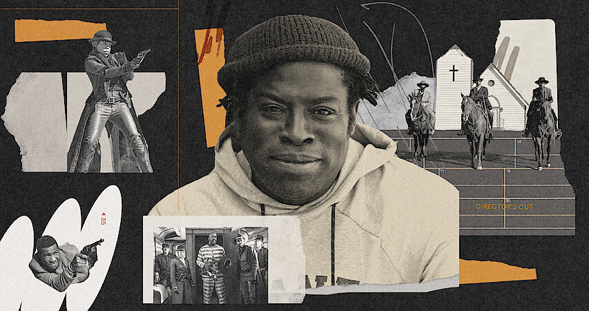
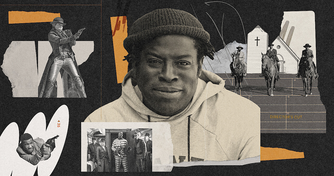
All About the All-White Town In 'The Harder They Fall'
There’s a deeper meaning behind Maysville.
By Olivia Harrison
Nov. 23, 2021
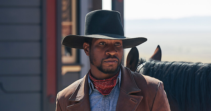
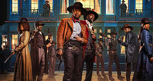
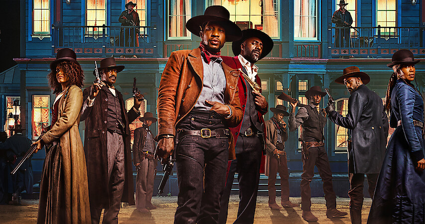
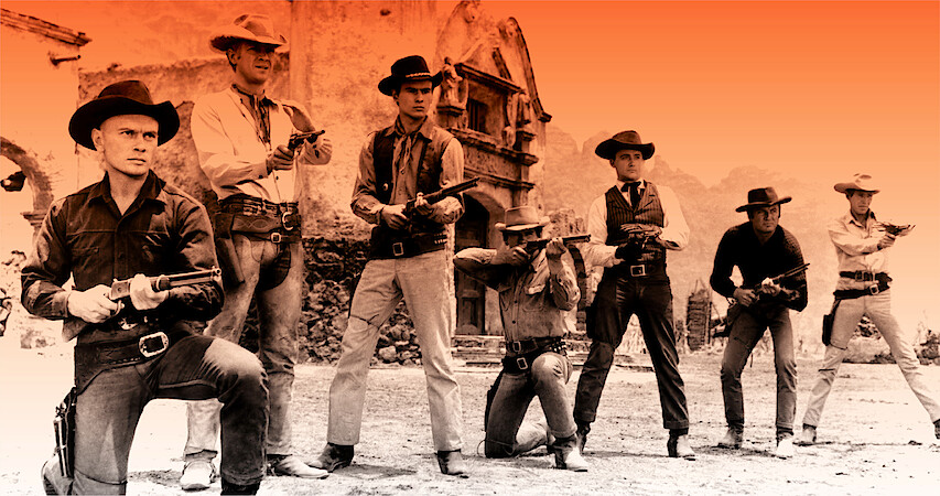
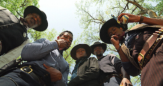
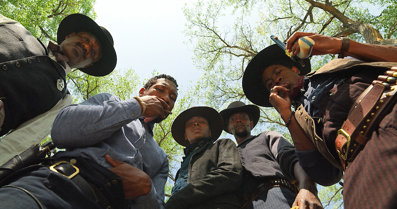
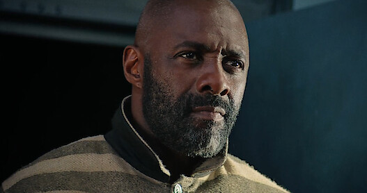
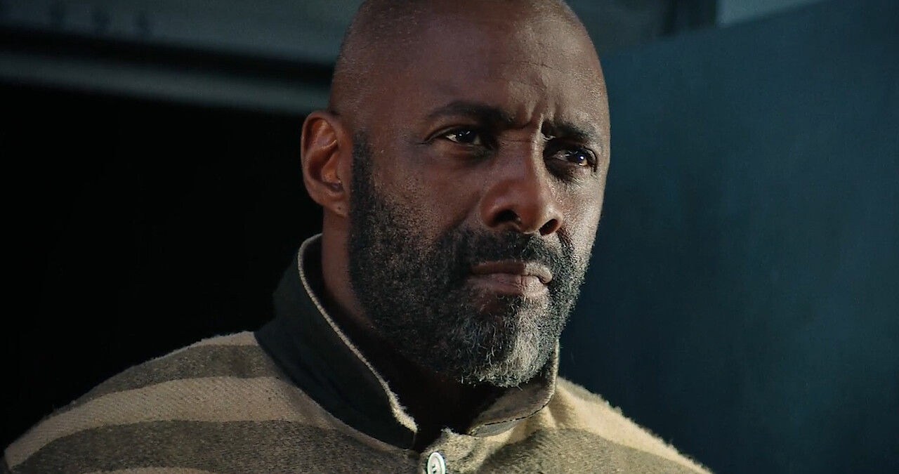
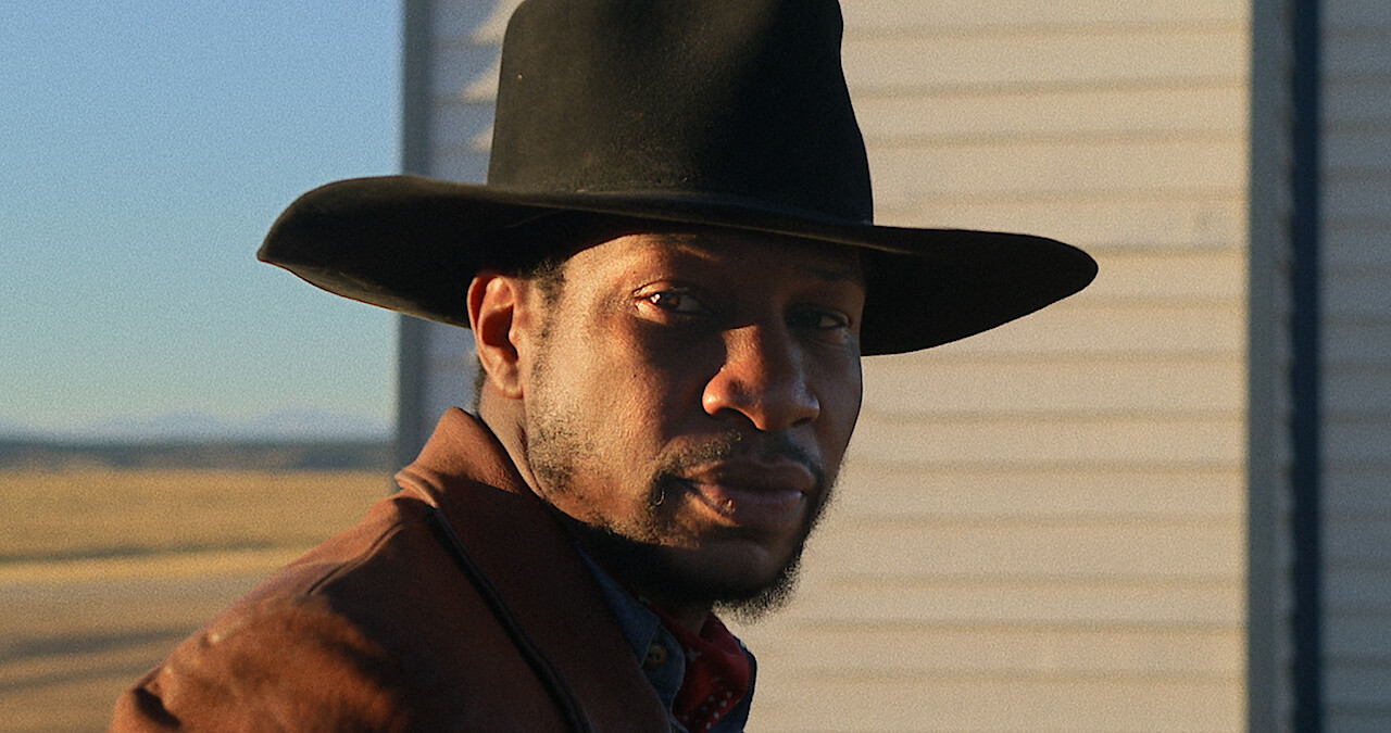
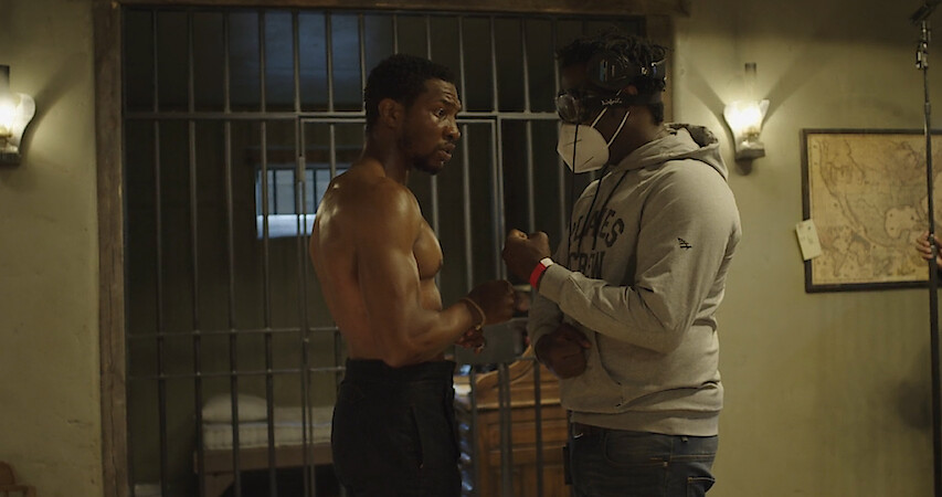
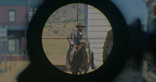
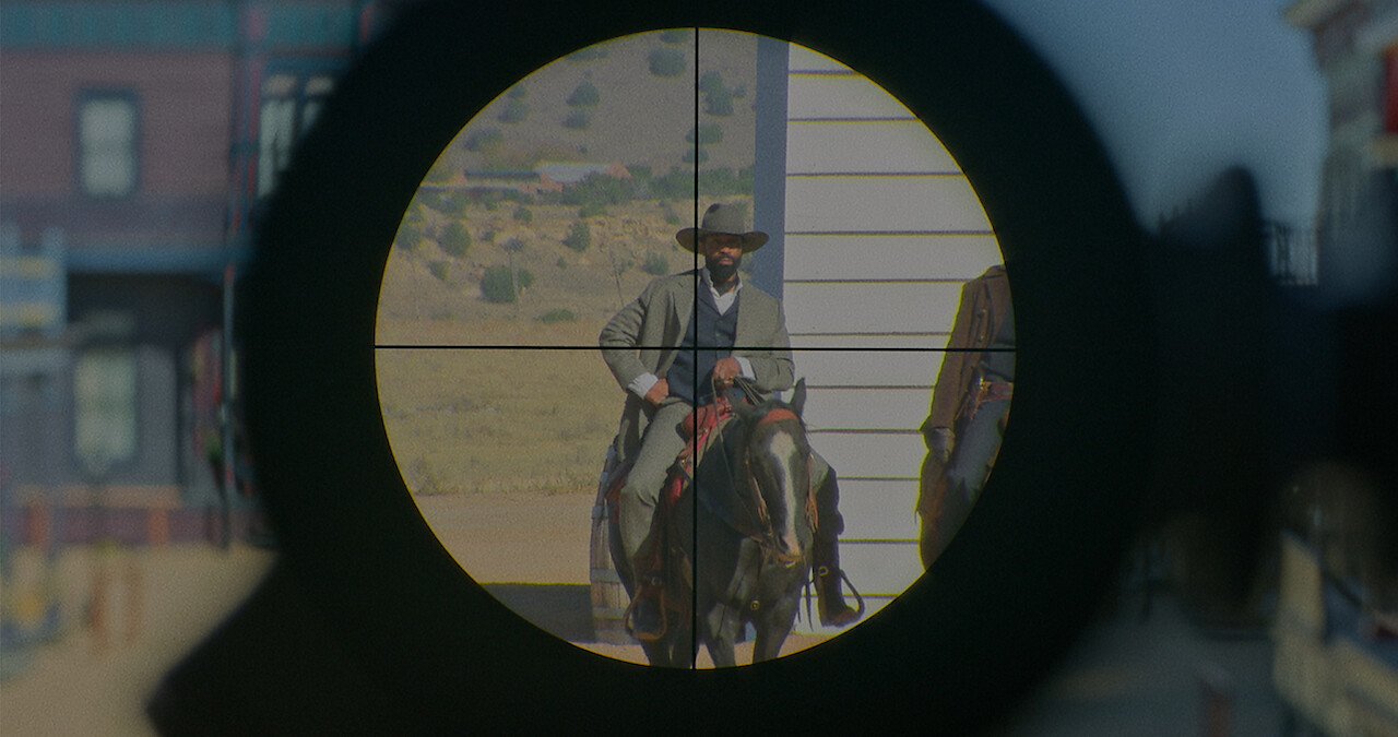
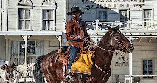
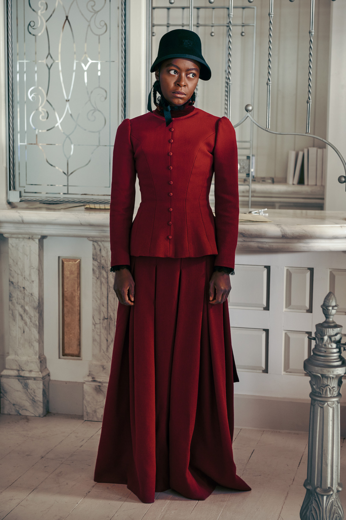
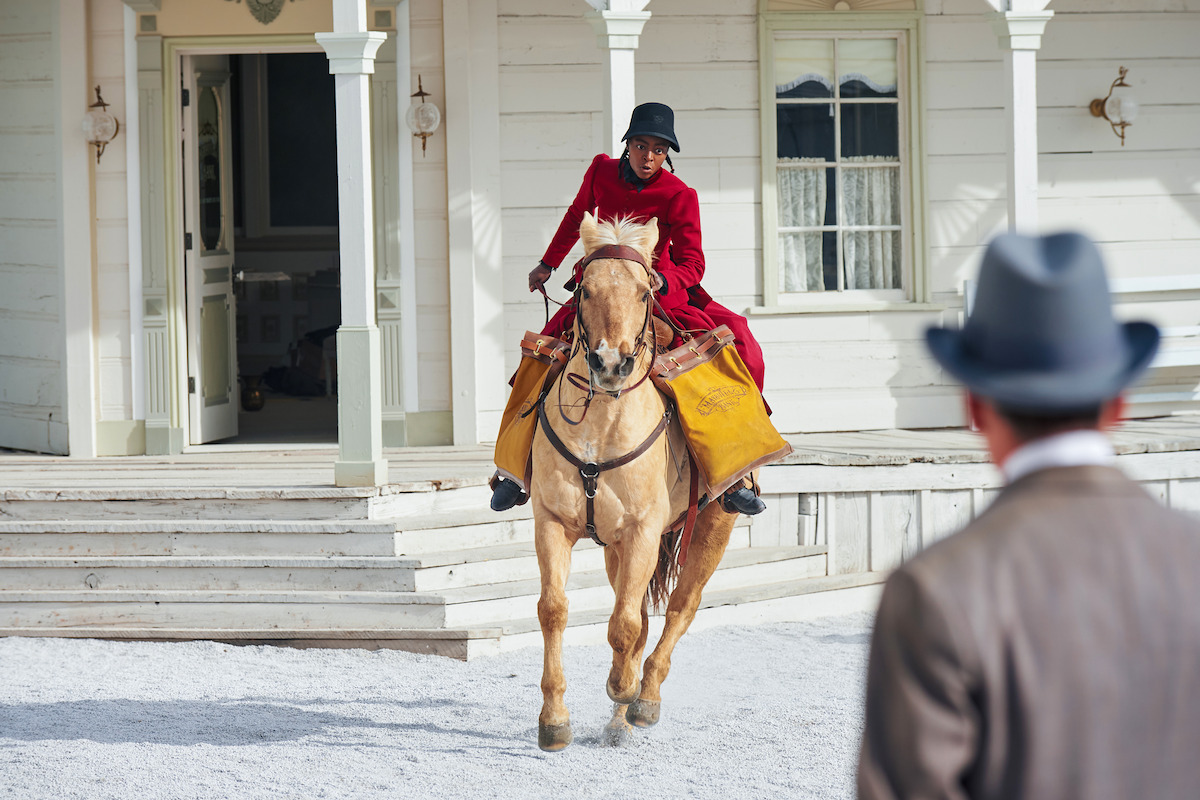
For the most part, The Harder They Fall looks like a classic Western. The action takes place in rustic towns featuring a single storefront-lined dirt road, saloons framed by velvet curtains and accented with antlers, and wide-open rocky landscapes. Every backdrop feels standard to the genre — except Maysville, the all-white-hued town whose bank Nat Love (Jonathan Majors) and Cuffee (Danielle Deadwyler) rob nearly an hour and a half into the film. As Nat and Cuffee ride into Maysville, it’s immediately clear that this is very different from the Wild West towns we’re used to seeing. Everything in it is entirely white.
Production designer Martin Whist didn’t immediately know that he wanted to make Maysville all white. “As I started my research and compiling imagery, I was drawn to white on white and just how that monochromatic approach can be so beautiful and interesting,” he tells Tudum. “As I was drawn to it, I just slipped into the idea of ‘Why stop here?’” After putting together a large wall of reference images, Whist took the idea to director Jeymes Samuel, who was totally game. “I said to Jeymes, ‘Why don’t we just make this a white town?’ and he looked at me and said, ‘Well, it is. What do you mean?’ I said, ‘No, I mean literally a white town. Visually, literally, a white town.’ Jeymes just laughed and, in his way, with his spirit and his creative bravado, he didn’t blink. He was with me.”
Even with Samuel on board, Whist and his team still had their work cut out for them. All of the towns were immensely challenging to create. “We had all these buildings to strip down, readorn and re-detail,” he explains. “A single room has walls, trim, window casing, mullions, floor, ceiling, set dressings, but when you have a whole town, you have building after building after building, each of which has its own set of walls to trim and details to dress.” While one might expect that using a single color for an entire town would make that process more straightforward, Whist says that wasn’t the case. “I didn’t just choose a really clean decorator-white [paint] and just paint the whole thing,” he says. “When you analyze the town, you’ll notice there are so many different variations of whites, in terms of chromatic value. If you put one on its own against a really crisp, pure white, it might read as green or as yellow or as orange, but when they’re all in that white spectrum, the overall impression is just white.”
Whist says working on Maysville was a “mind game” because his team had to plan several steps ahead with very little room for error. On days when the team was working on colors, graphic designer Wendy Stokes brought in a big crystal for good luck. “We had to get into a zone,” Whist says. Though the concept was intimidating, it gave the whole team opportunities for creativity. Construction coordinator Arlen Johnson found a local pumice rock that, when ground up, was pure white. So they brought in truckloads of the stones and used them to cover the ground of Maysville. “There was nothing that wasn’t touched,” Whist explains, and the end result is something really special and unique in the world of production design.
“It was a treat, honestly, to be able to do this, because I love the look, but it’s something you see much more often in fashion,” he explains. “Let’s say you’re looking at a traditional wedding dress — you’re going to have variations of white in that through sheen, hue and texture. That’s just so gorgeous, and there are just subtle shifts within the monochromatic spectrum of white. I’ve always been drawn to that.”
Maysville is visually stunning and packs a punch, but beyond that, the choice to make the town white has a deeper meaning for Whist. “We were open to humor and we were open, obviously, to irony, because it’s wildly ironic that the white people’s town is the color white, but I also wanted it to feel almost like there’s a supernatural quality going on, which in turn shows the white people as ‘other,’ ” he shares. “It’s almost like what a kid might think [about] where white people live: It’s all white and it’s kind of frightening.” This concept of white people as “other” is as rare in mainstream American films as alabaster buildings on a chalky trail are in Westerns. The Harder They Fall and its production designs are clearly anything but standard.