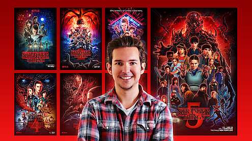
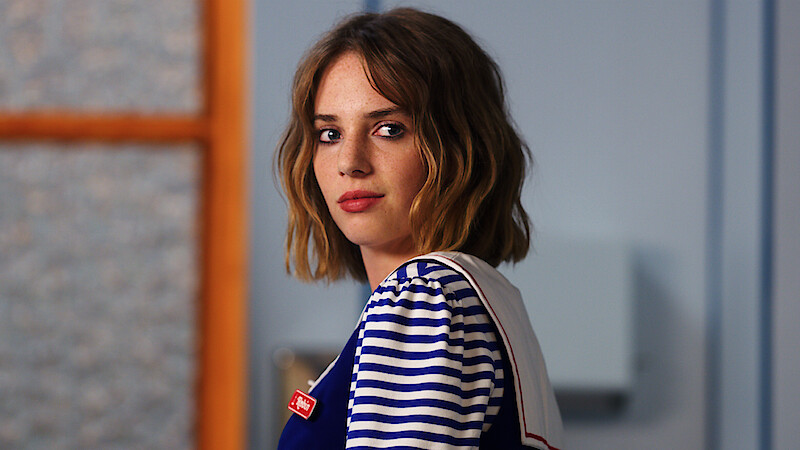
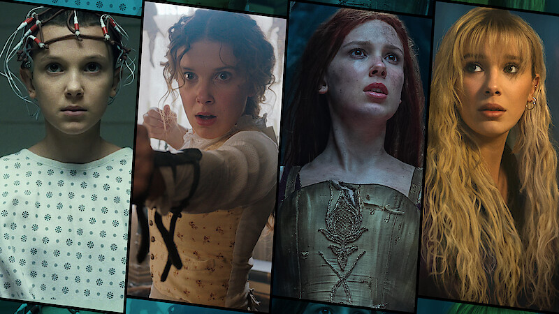
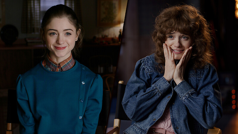
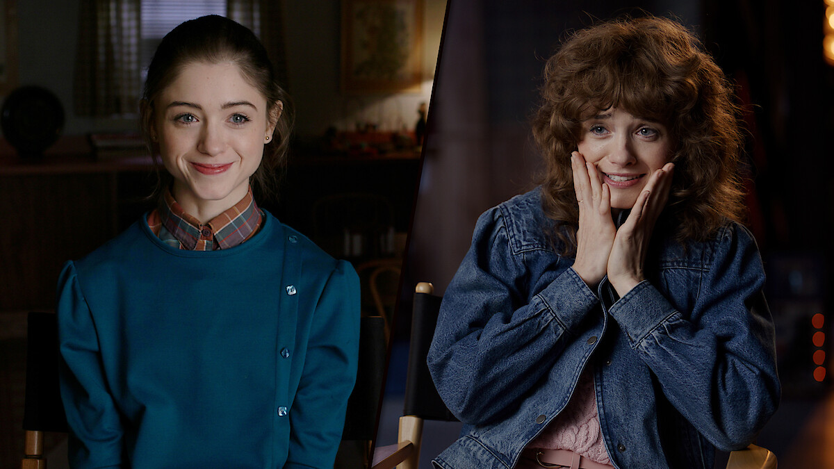
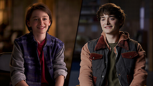
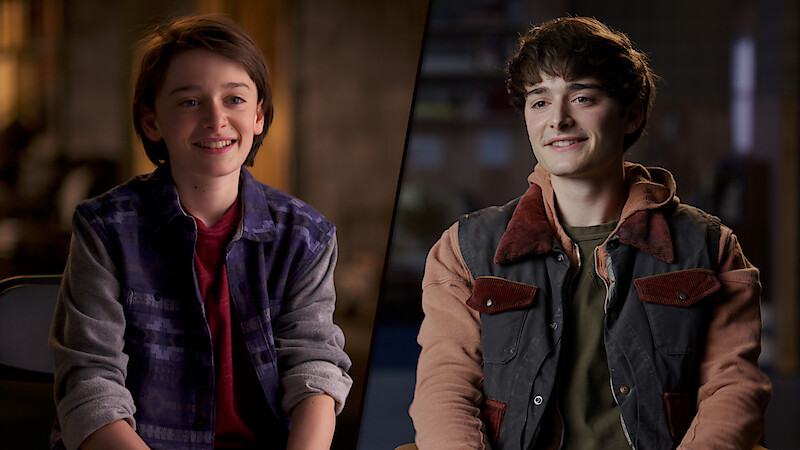
For five seasons, Kyle Lambert has given Stranger Things fans a tantalizing window into their favorite show.
His posters tease what’s to come for Hawkins, packed with world-building designs, Easter eggs, and 1980s nostalgia. The illustrator’s final artwork for Season 5, which drops today (you can see it below), marks the end of that almost 10-year journey.
“Whenever we get to do a season poster, it definitely feels like Super Bowl day,” Lambert tells Tudum. “All the experience I've gained and all the excitement build to this moment where I get to create the artwork that represents the next season of the show that everyone’s excited to watch.”
Lambert, 38, got his start at a young age, sketching VHS covers he loved as a child before mastering the tools to create artwork digitally. He caught the attention of the Duffer brothers when they spotted a fan poster he made for J.J. Abrams’s Super 8, a sci-fi movie set in the late ’70s. “Stranger Things was, on the surface, a love letter to E.T. and a lot of the Spielberg movies and horror movies from that ’80s era,” says the illustrator, who lives in Los Angeles. “They were looking for a poster that paid homage to the kind of movie posters that were out at the same time.” Pulling inspiration from some of his favorite artists, including poster designer Drew Struzan (Back to the Future, Star Wars, Indiana Jones), Lambert got to work delivering one season after another of epic key art.
Below, he lifts the curtain on his design process.
How did you approach designing the very first Stranger Things poster?
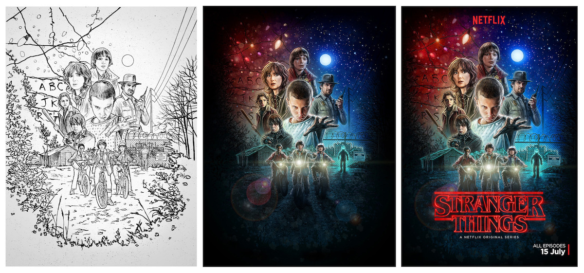
Kyle Lambert: I spent a lot of time researching what ’80s movie posters looked like and what techniques they used, because I was going to have to try to reproduce that digitally. I really wanted to make it look like a piece of art. I didn’t want it to look like it was made of photos — it was all about this illustrated style. I spent a lot of time drawing details into the characters, because once I add color, the linework shines through and gives the poster an illustrated look.
It is really important to me that the poster screams what you’ve watched. It should feel like the whole show has exploded onto a canvas. Watching the episodes really helps to get the vibe. The cinematography helps as well — what kind of lighting, what colors — because I’m basically trying to be as faithful as possible to what people are going to see … but then try and make it as much of a tease as possible.
Fans scrutinize your posters for Easter eggs. How do you drop clues into your illustrations?
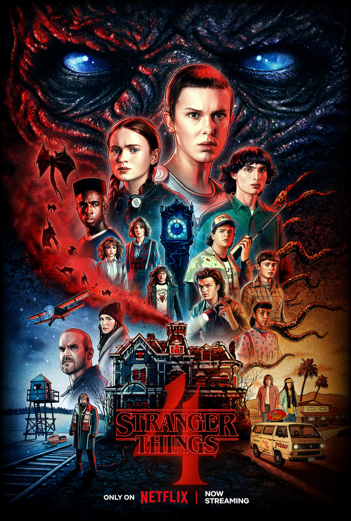
Lambert: As soon as I get the episodes to watch, I usually go away and start sketching ideas very quickly — really primitive thumbnail sketches with stick people. One of the things I try to do is put environmental elements into the posters as much as possible. Initially, when people saw the first poster, there was a lot of, “Why is there an alphabet on the wall? Why are there Christmas lights? What’s this guy in a hazmat suit? Why is there a bald kid?” It was very mysterious, none of it really made sense at first glance, but then you’d come back, watch it again, and look at the poster afterward, and you think, “Ah, that’s what it is.”
With the Season 1 poster, everything was a teaser, everything was an Easter egg, because nobody knew anything. Since then, it’s been very, very difficult to get teasers in there.
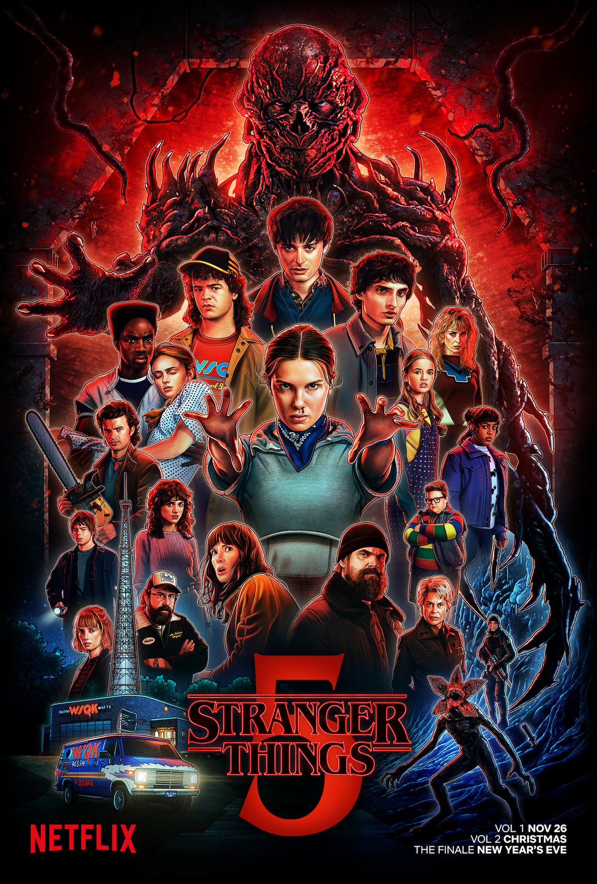
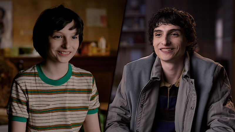
There’s a lot of mirroring that I was trying to do between the Season 1 and Season 5 posters. Will is positioned at the top, Eleven is in the middle, which she hasn’t been since the first season, and she has her two hands out versus her pose [with one hand out] from Season 1. There’s a lens flare on the van in the same way that there was on the bikes. I used the same stars and the same sky from the Season 1 poster in the Season 5 poster as a little Easter egg. I put it in the bottom corner, where Jonathan has his flashlight.
How else did you infuse some of that nostalgia for previous seasons into the Season 5 poster?
Lambert: I wanted to get a Demogorgon in, because we had never gotten them on any of the posters. I really wanted to put a Demogorgon in the first poster, but, again, I didn’t want to reveal it.
Even though it doesn’t quite have the same color mixture — there’s a lot more red in this poster — it still has the same blue as the original and the same cyan-blue-green in the bottom left-hand corner. And, as I said, the same sky as well.
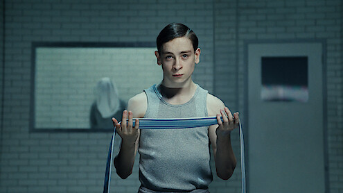
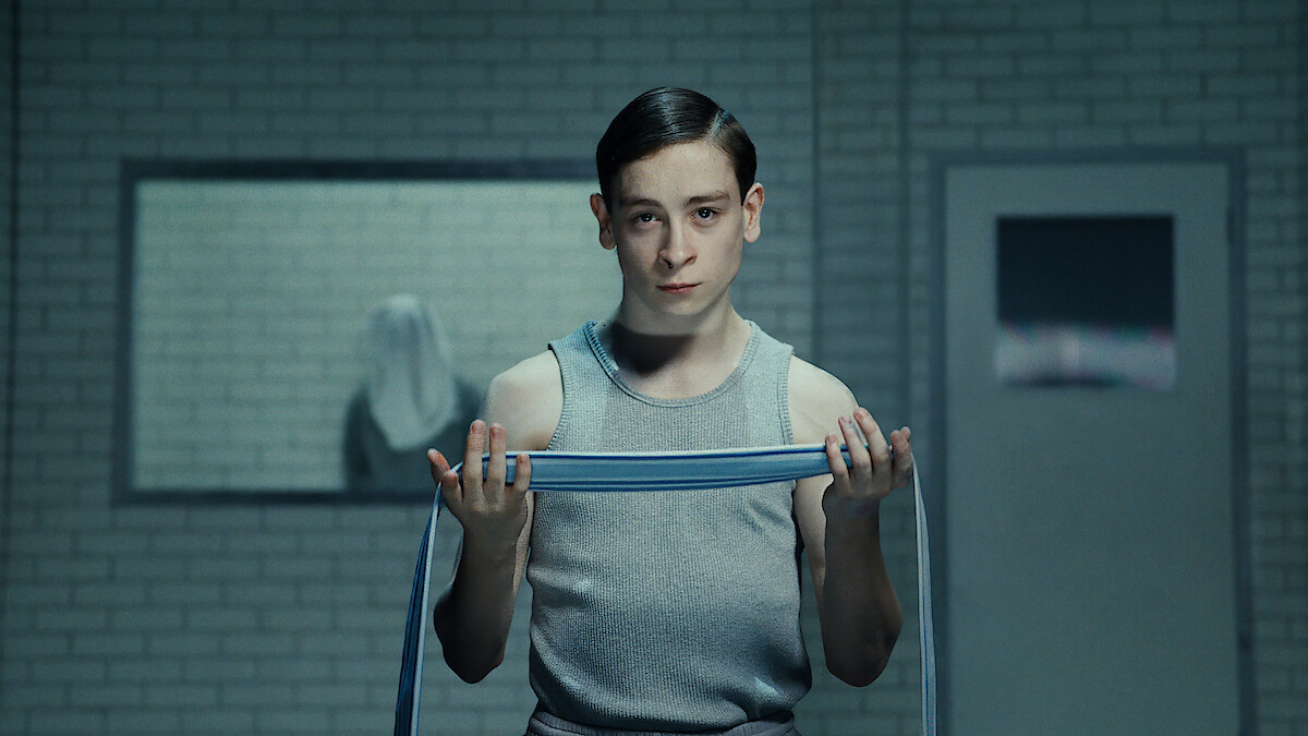
Vecna plays such an increasingly intense role in the posters as the seasons go on. What goes into capturing him?
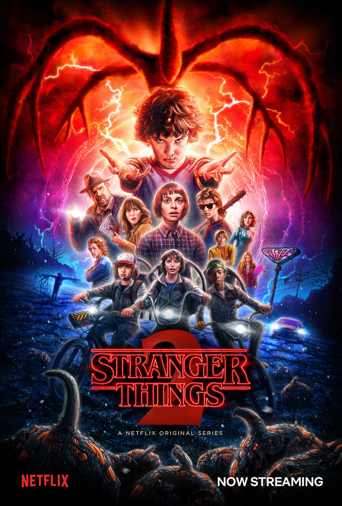
Lambert: Somebody like Vecna is the absolute worst thing you can possibly have to draw, because [he’s] just so intricate and detailed. Nothing about it is simple. For Season 4, I got to do a super close-up of his face, so there were lots of details around the eyes, pores, and all the texture on the skin, the ripples that he has around his face. For this one, I got to do a full-body pose. It was all about the silhouette, [thinking,] “How do we make him look strong and intimidating?”
It’s a case of balancing how dark it is but also trying to show him as well. That was one thing I talked to the Duffer brothers about — they wanted to make sure that you could see all the details in his face and that he had this really ominous red glow from the gate.
Do you have a favorite character to draw?
Lambert: I love drawing Dustin. For some reason, his face just comes together really, really well. There are great shots of him to work from. He’s always got these fun costumes on, and there’s obviously a different hat each season as well, which has been fun to put in there. I always look forward to figuring out what his pose is going to be each year.
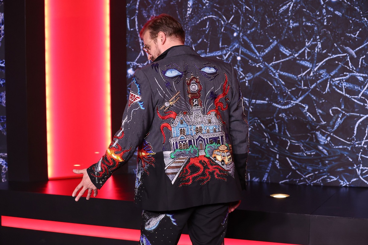
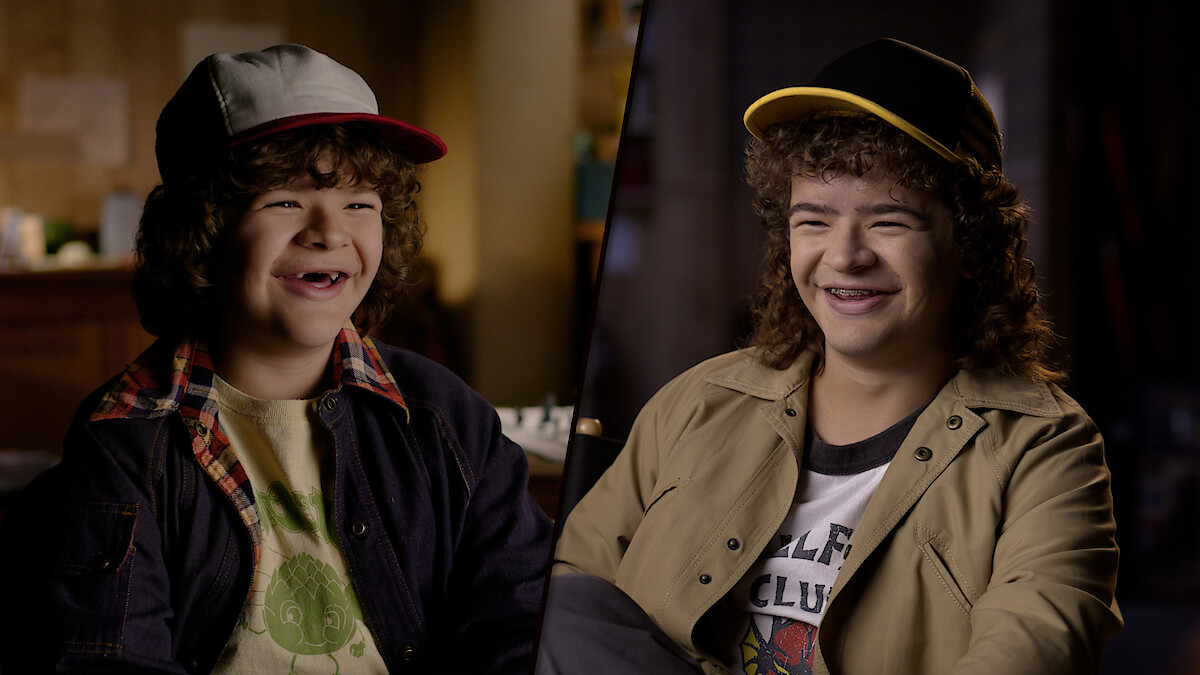
PHOTO BY ARTURO HOLMES/WIREIMAGE
Looking back over the past five seasons, what have been some of the most memorable moments of being a part of this world?
Lambert: The first big moment for me was seeing the artwork on one of the billboards in LA. I got an email from the Duffer brothers, and they said, “Thanks so much for your artwork, it’s all over LA.” I met them [during Season 1] as well, and I got to show them close-ups of how I’d done the artwork. I brought my iPad out to their studio and showed them everything. That was cool.
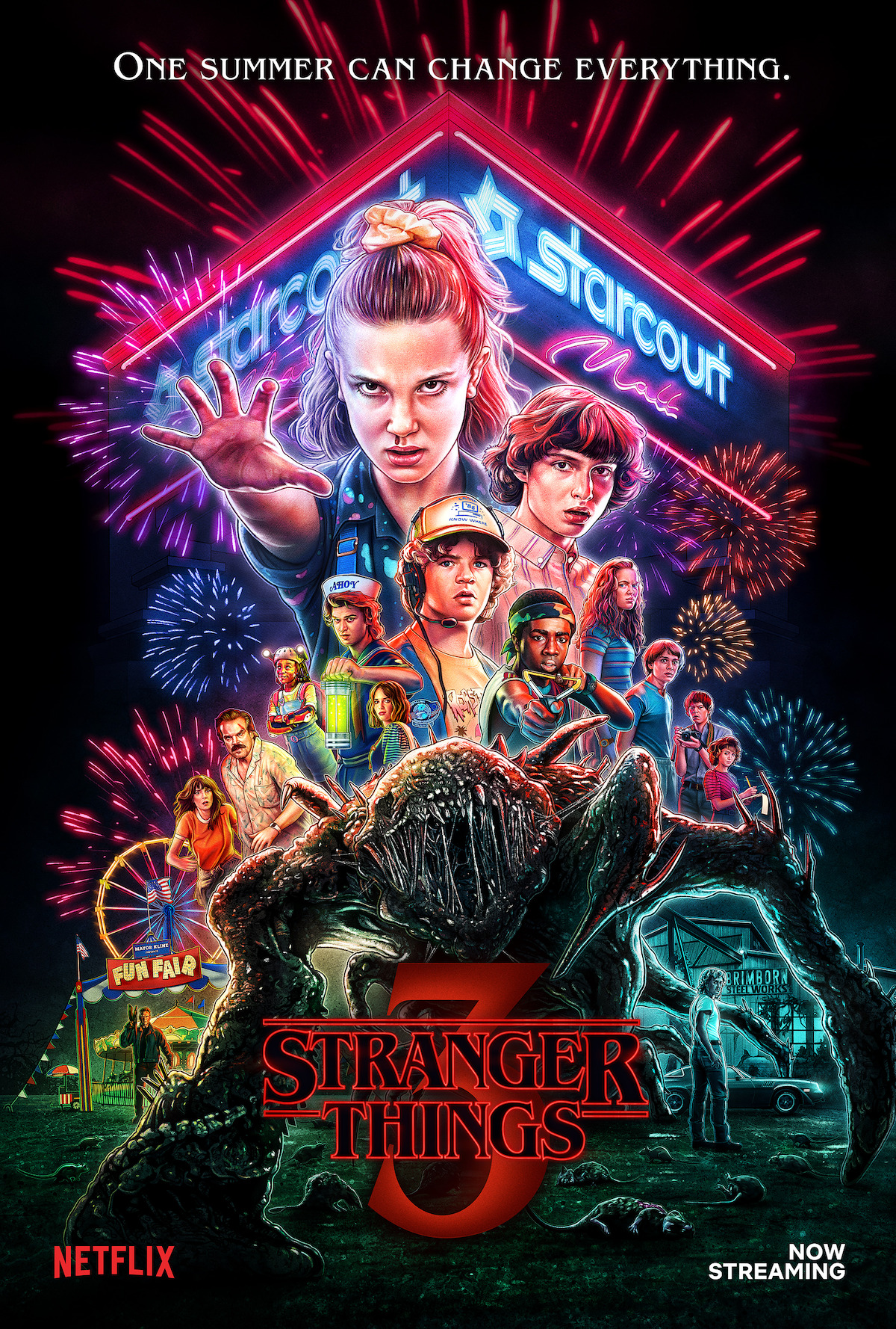
There have been loads of pinch-me moments throughout the whole thing. David Harbour (Jim Hopper) is a big fan of the illustrated posters, and for Season 4, he asked if it would be possible to get an early look at my poster design so he could have it embroidered onto his jacket for the red-carpet premiere. I had only just finished my early sketch at that point, so his tailor took my drawings and elements from previous posters and created an incredible custom design. His jacket was a showstopper at the premiere. I remember being blown away when I saw the videos of David spinning in slow motion, showcasing the various poster elements I had designed, reimagined with thread and sparkling sequins.
There’s a reason I got into this industry. It’s because I love artwork, I love movie posters, I love movies, I love TV shows. I’m just a big fan of all these things, and to be able to be involved in one of these huge franchises that reaches the entire world has been an absolute dream.
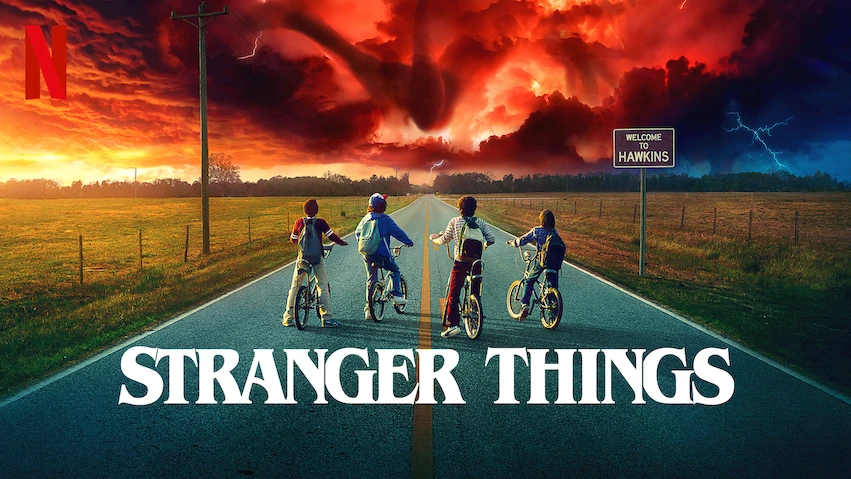
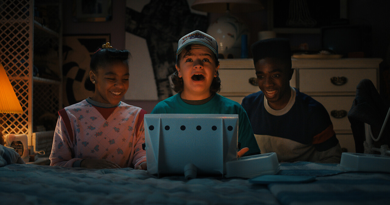
The first four episodes of Stranger Things 5 will be released on Nov. 26, followed by three episodes
on Christmas, and the finale
on New Year’s Eve. Find out when new episodes arrive in your part of the world here.